Reintroducing “LLC”
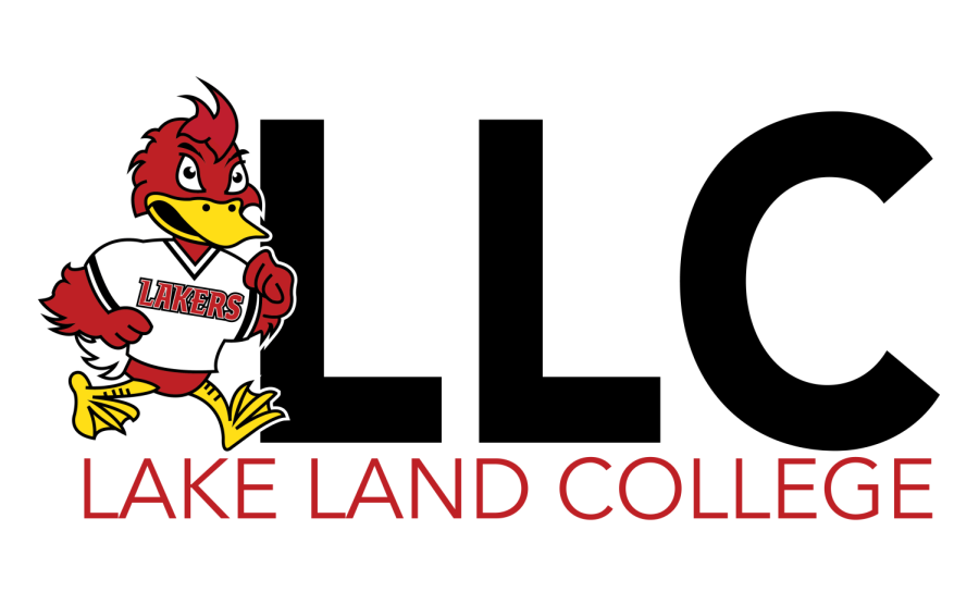
This image is an approved use of the acronym “LLC”. The marketing team hopes to see the acronym used more around campus. Photo via Megan Nelson (MPR).
November 1, 2022
This year, the Marketing and Publication Relations department at Lake Land College (LLC) has made a few branding changes. The biggest difference introduced by the Marketing team is the revival of the acronym “LLC.”
Megan Nelson, marketing publication and design coordinator, stated, “Previously, under our old branding standards, we moved away from using the abbreviation due to some negative wordplay associated with the acronym ‘LLC.’ We actually found that a lot of our students didn’t refer to Lake Land as ‘LLC’ unless they were maybe texting. So, that was kind of our reasoning for removing that from our branding. But, we have decided to reintroduce it in apparel. So you may see that on some things in the bookstore and throughout campus now.” The acronym can be seen used around campus on apparel, accessories and other college related pieces. However, by branding standards, the marketing team still requires the college’s name to be spelled out when referred to in a header or paragraph.
Nelson also explained that LLC’s college seal has become more open for use than it has been in the past. The seal used to be exclusively for the President’s office and the Board of Trustees. However, the seal will is now permitted for the use of professional and business matters. Business and professional merchandise, such as polos with the seal on them, may be sold at the bookstore. Portfolios are also considered professional and, therefore, can use the college’s seal as well.
The college’s branding and logo have remained the same since 2015. Although the acronym will be used more often, LLC’s logo will stay the same. The President of LLC, Josh Bullock, stated that branding is taken very seriously at LLC. Bullock noted, “We went through a lengthy process to truly understand, ‘what does Lake Land College mean to our community?’ and that was across the board, students, staff, community members, employers, we really wanted to know what Lake Land meant to them. That’s when we came up with our new branding, which is what we use today, where it says ‘Lake Land’ and ‘College’ underneath. Much of what we’ve done is to continue to try to build that brand in the campus community.”
Although the college’s logo itself will stay the same, the marketing team has added another acceptable color for the logo to be displayed in. Nelson said that “We previously only used the logo in black or white on the appropriate colored background. But now, we decided that we are going to also allow it to appear in red as well. So that will be an acceptable form of use moving forward. The only caveat to that is we don’t want to use the red logo on a black background or vice versa because of accessibility reasons. It is very hard for someone with color blindness or visual impairments to see black on red and vice versa, so that’s our only requirement.” A tertiary color palette is also being developed by the team and will be introduced this fall. These colors will be used for specific areas of study and programs within the study. These are faint background colors that will not be used as the main focus. Nelson described the palette by stating, “The colors won’t be prominent. They are more of an accent or ‘as needed.”
New navigation signs have also been implemented around campus. Bullock mentioned that these signs were changed in order to bring consistency throughout all of campus. All signage poles have been standardized to reflect the new branding. Bullock said that “As we continue to update things such as our wayfinding, we are carrying that theme through everything we do and that consistency of the brand, so we really won’t be rebranding the college. It really is about continuing to build on the brand that we have.”
Keep an eye out for all the new changes on campus while the marketing team continues to develop more ways to build on LLC’s brand!


